
Blog / Article
5 signs your business has outgrown its logo
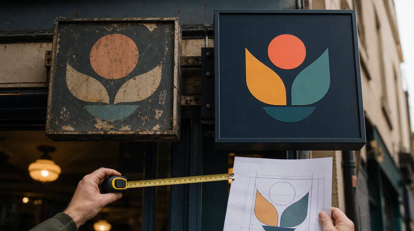
Most local businesses get their logo made once, early on, often in a hurry and on a small budget. Years later the business has grown, the menu has changed and the customers are different, but the logo is still the same. Here are five signs it's time for a refresh.
1. It falls apart when it's small
Your logo now lives in tiny places: your Instagram profile picture, your Google Maps listing, browser tabs and delivery apps. If fine lines disappear, the text becomes unreadable or the whole thing turns into a blob at small sizes, customers scrolling past won't recognise you.
2. It doesn't match what you sell anymore
Maybe you started as a coffee counter and now serve full breakfasts, or added catering, or moved upscale. If your logo still tells the old story, it quietly sets the wrong expectations, on price, on quality and on what people can get from you.
3. There are five different versions floating around
The sign says one thing, the menu another, and Instagram has a cropped screenshot of the business card. When every touchpoint looks slightly different, your business feels less established than it is. Consistency builds trust.
4. You avoid putting it on things
If you hesitate to put your logo on cups, bags, uniforms or a van because it doesn't look great, that's lost free advertising every single day. A good logo is something you're proud to put everywhere.
5. Customers describe you differently than you look
Read your reviews. If people call you "cozy", "premium" or "the best in town" but your logo looks cheap, cold or dated, there's a gap between your reputation and your first impression. Closing that gap is what a rebrand is for.
What a smart refresh looks like
A refresh doesn't mean throwing everything away. The best rebrands keep what customers already recognise (a colour, a shape, the name) and modernise the rest:
- Simplify the mark so it works from a sign down to an app icon.
- Update the lettering to something clean and readable.
- Pick a small, consistent colour palette.
- Create versions for every use: horizontal, stacked, icon-only, light and dark.
- Roll it out everywhere at once, so the change feels intentional.
Not sure whether your logo needs a light touch-up or a full redesign? That's exactly what our free brand check answers.